Here’s a look at some of the websites I’ve recently worked on.
WordPress | Bastion Agency
Custom WordPress site for a global agency.
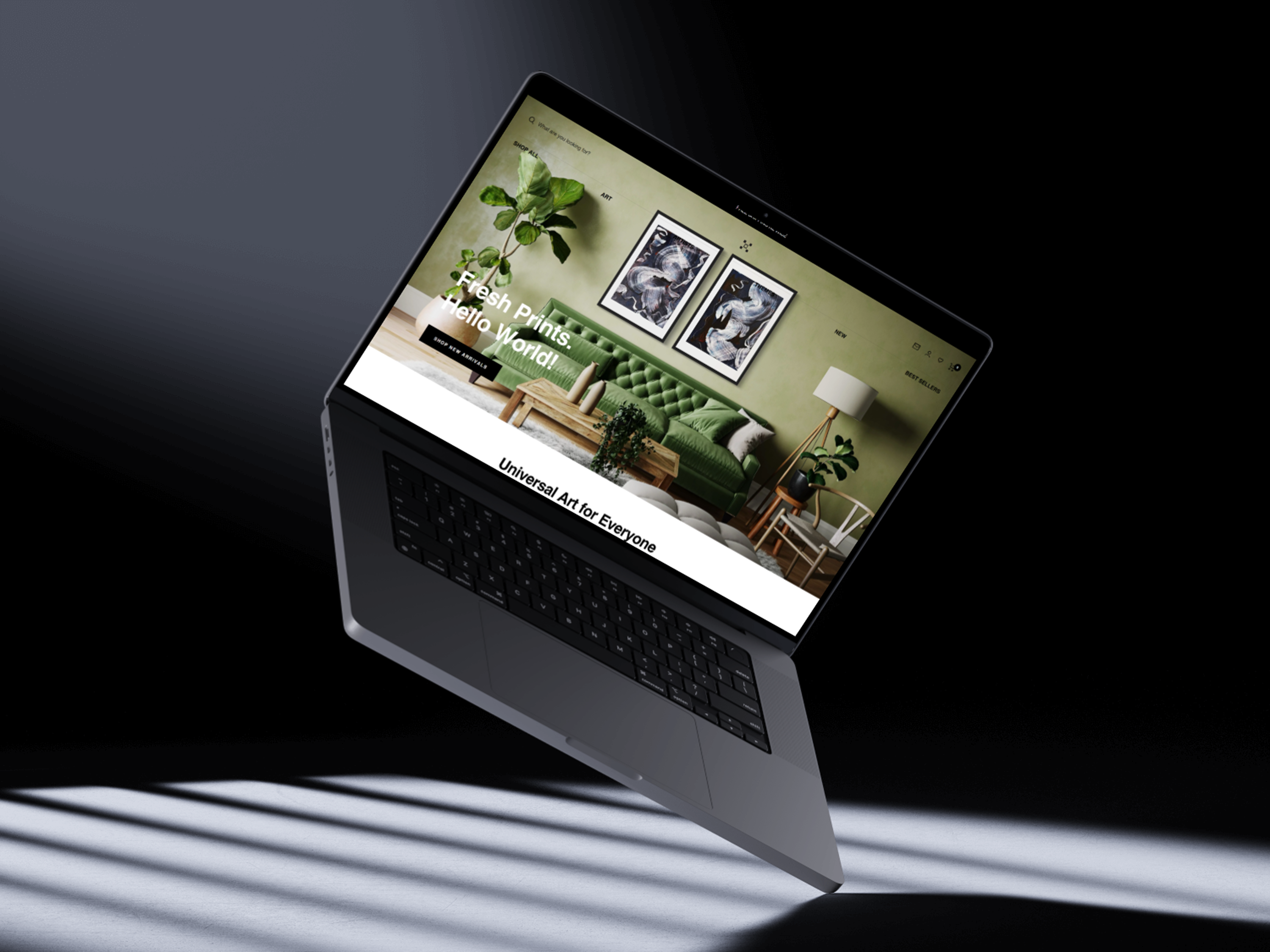
Shopify | Art and Realism
Shopify development for a premium art retailer.
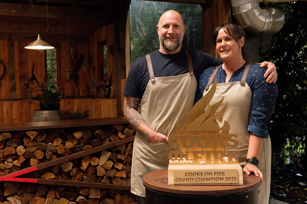
WordPress | Smokin Oak Barbecue
Website for a BBQ brand made famous by winning a national BBQ TV show.
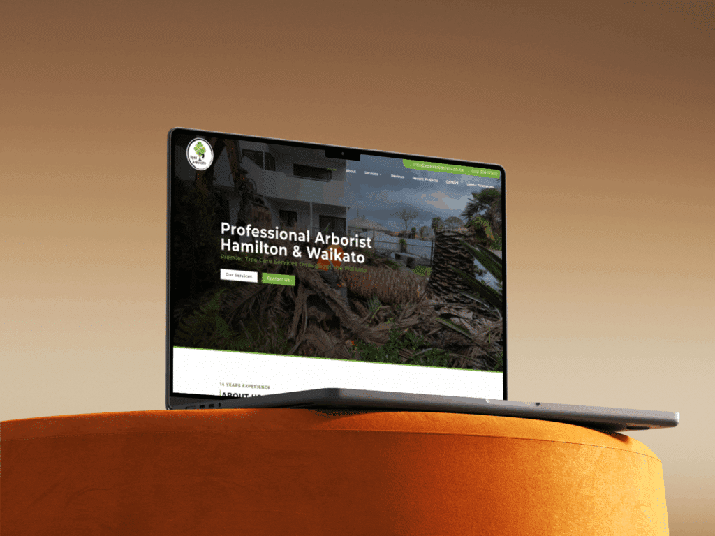
WordPress | Apex Arborists
High-ranking website for a leading local arborist.
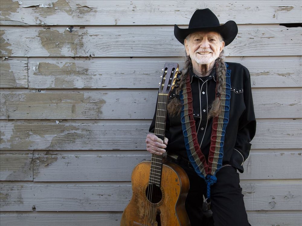
Shopify | Willie's Remedy
Shopify development for a THC-infused social tonic crafted by Willie Nelson.
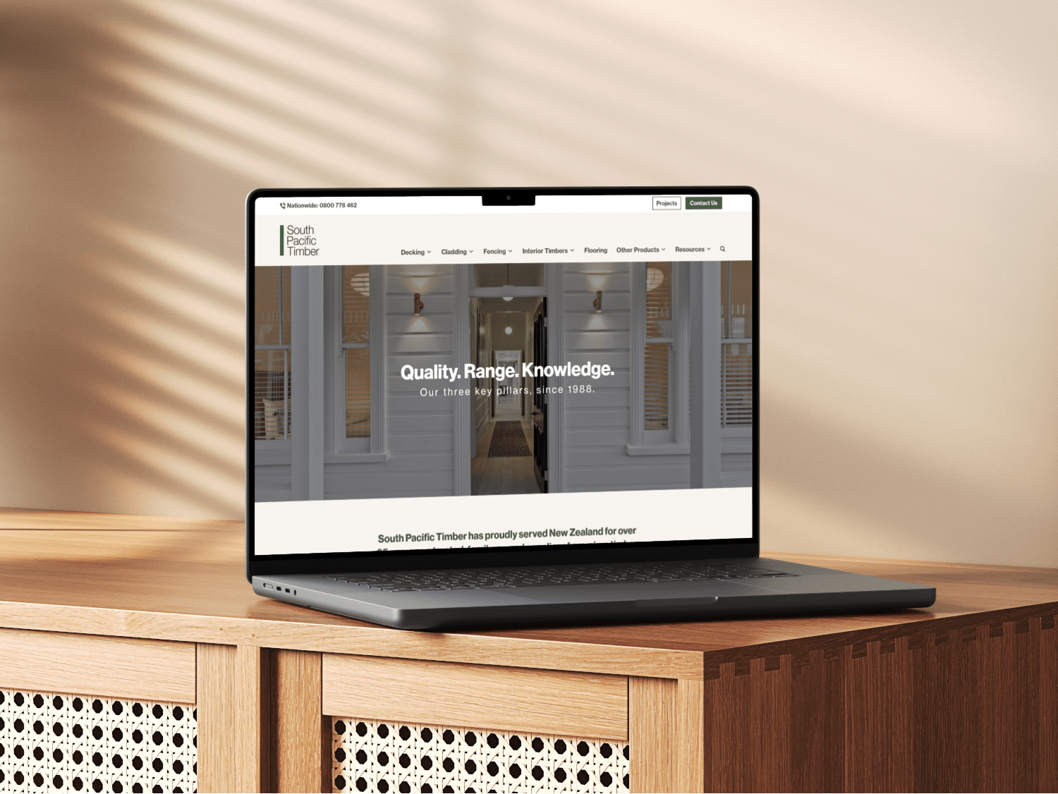
WordPress | South Pacific Timber
Conversion-focused website revamp for a major player in the timber industry.

WordPress | Bike Rider Magazine
A faster, cleaner site for the country’s top motorcycling magazine.
Great working with Dan from Innovate. Thanks to your knowledge and skill our website looks great and functions really well. I would recommend anyone that is looking for a custom website to get in contact with Dan and he will guide you in the right direction.
Our website needed improving, and so we asked Innovate to give it a revamp. We found the Innovate service to be extremely helpful with improving the look of our website, and the functionality. We’ve now hired Daniel and Innovate to build another, more complex website for our other business, which will be going live soon. We appreciate the speed of service and professionalism.
Daniel did a great job with giving our website a fresh and innovative vibe! We really appreciated his constant communication and his perseverance through our unexpected issues!
We used Daniel to create the website for our construction business and for ongoing support. He gave us a great product, is always fast to respond and offers a great service.
Daniel helped us re-design our whole website. Since working with him, our internet presence has increased significantly, and it has helped drive up our customer base 🙂 Thanks Daniel, we would definitely recommend your services to everyone!
Book a call. New spots open.